http://www.richardroeper.com/
This is the official website of Chicago Sun-Times columnist Richard Roeper. The site includes his columns on the Chicago Sun-Times, his movie reviews, and his entries to his blog, among other things. Overall, it's a slick and polished website that makes very few design missteps and avoids many of the common pitfalls of beginner web designers. The main "attention getter" on the home page is the image/link at the front of the page that leads to his blog, movie reviews, or Sun-Times column depending on what's showing on-screen.
The best thing about this site is its underlying simplicity. It doesn't try to cram too much content on a single page, and everything is clear and easy to read.
Overall, Roeper seems to have found himself a talented group of designers who have a keen eye for what makes solid design.
Wednesday, September 30, 2009
Tuesday, September 29, 2009
 The Wind Waker remains one of the best-selling and best-reviewed games in The Legend of Zelda series, but it has nonetheless always had its detractors in the form of Zelda purists who were hoping for a darker, more realistic looking game in the vein of past Zelda games. Evidently, these sentiments didn't fall on deaf years, as in 2006, Nintendo released the next installment in the 20+-year-old series, The Legend of Zelda: Twilight Princess, a return to form after Wind Waker's drastic design changes. Basically, the reception to this decision was almost the exact opposite of Wind Waker's; those salivating for a darker Zelda adventure were more than satisfied with the results while Wind Waker fans hoping for more of a direct follow-up to that game were disappointed. Then there are people like me, who are on the fence.
For the most part, I like the art style of Twilight Princess a lot, but there are a few nagging flaws that keep me from appreciating it as much as Wind Waker's toon-shading, which I'll get over with first for the sake of ending on a positive note. For starters, the game looks murky. To a certain degree, this is intentional since there are quite a few sequences in the game that draw their entertainment value from the player not being quite sure what's going on or what to do. But it's definitely overplayed, and combined with the relatively underpowered hardware the game had to work with, this makes for some blurry and rather ugly effects, something Wind Waker largely avoided. Furthermore, the game's graphics demand more than what the hardware can deliver. No doubt Wind Waker was no walk in the park to design, but in that game, Nintendo set more reasonable expectations on themselves than they do here in Twilight Princess. Much like the murky look, this makes for blurry elements in the design, almost as if the game's designers weren't always sure of themselves as far as how the art style should really look. All in all, while these are really only minor misgivings, they still keep the game's art direction from being as good as it could have been.
That being said, it is doubtlessly well-made artwork that retains the charm and timeless look of the Zelda games. Even if it lacks the crisp, rich colors of Wind Waker, the art direction in Twilight Princess does borrow some elements from its predecessor, making for plenty of colorful, whimsical design elements and a certain degree of charm that remains even during the game's darkest spectacles. Another win for Twilight Princess is in its cinematics, which are by far the best in any of the Zelda games. The gritty look helps make these cinematics atmospheric and thoroughly engrossing, only made better by the engaging storyline. One other aspect where Twilight Princess is a stylistic improvement over Wind Waker is its technical prowess. While vastly inferior to what competing games and consoles have to offer, Twilight Princess is a cut above its predecessor with flawless lighting and crisp (if occassionally blurry) textures.
Even if it's not quite as good as it's predecessor's near-perfect artwork, Twilight Princess is easy to qualify as a great-looking video game, presenting whimsical colors despite the game's dark tone, extremely well-done cinematics complemented by a compelling story, and reasonably competent, if somewhat flawed, technical polish.
 Back in 2001, when the popularity of The Legend of Zelda video game series was at its peak, Nintendo revealed the next installment in the series, The Wind Waker. Replacing the dark, gritty art style of past Zelda offerings was a new toon-shaded look, deliberately designed to look bright and cartoonish, with caricatured characters and saturated colors. Much to Nintendo's surprise, fans were extremely disappointed, and this change in art direction remains one of the most controversial design decisions in video game history. Those expecting a darker Zelda adventure in the vein of the previous games were outraged that Nintendo was apparently shifting the series' focus to a younger demographic. This all changed when the game was released in 2003, when it received rave reviews from critics and fans alike and was a commercial success, becoming the most successful pre-order campaign in Nintendo's history. The gamble had paid off.
The toon-shaded art style, which met a generally negative reception prior to the game's release, turned out to be surprisingly well done. The game plays much like an interactive cartoon, always colorful, lifelike, and whimsical. Despite the simplicity of the artwork, there is a surprising amount of detail as well. Nintendo has become infamous in recent years for having its consoles and games graphically underpowered compared with the likes of Microsoft's Xbox and Sony's PlayStation consoles. While The Wind Waker isn't exactly the most graphically detailed video game ever made, there are nonetheless plenty of great lighting effects, beautiful color schemes, and rich textures to be found here. At the same time, however, the designers admirably refrained from overplaying the cartoonish look by complementing it with a genuinely compelling story that's rich with memorable characters and deftly balances humor with dramatic tension. The Zelda games rarely have terribly complex storylines, but The Wind Waker manages to join the select few that do.
Overall, Nintendo may have made some controversial choices when making The Legend of Zelda: The Wind Waker, but they definitely proved worthwhile in the end. It may not have satisfied every Zelda loyalist, but the game took a risk and came through.
References:
"The Legend of Zelda: The Wind Waker" 29 September 2009.
Wednesday, September 23, 2009
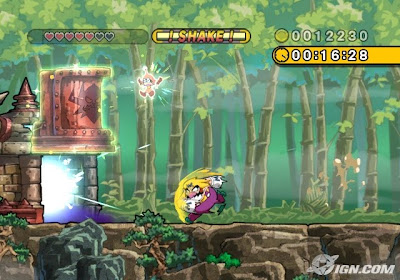 This is a screen shot of the 2008 Wii video game Wario Land: The Shake Dimension. It is a sequel in the Wario Land series, which is itself a spin-off of Super Mario Bros. Although it has been fairly well-received by critics and general audiences alike since release, those sentiments aren't without their criticisms. One of the most common complaints leveled at Wario Land is its relatively short length. This is a surprisingly interesting point of discussion because it recognizes one crucial characteristic that distinguishes great games from not-so-great ones: longevity.
Generally speaking, when you see a movie, it doesn't really matter to you how long the movie is. What's important is what the film manages to achieve during its runtime. If it's a good film while it lasts, then it doesn't make much of a difference whether it was 80 minutes long or 150. To be sure, the length of a film may have some bearing on its quality, but even that is due to poor pacing, not the length itself. Gamers, however, aren't quite as forgiving. When evaluating a video game, the typical gamer will take the length of the game into account as a factor in judging its quality. The longer a game is, the higher it is likely to rank in that category.
I find such concerns to be legitimate. Although I believe Wario Land critics severely underestimate the game's longevity, owing to its heaps of replay value, games that offer a bang for your buck definetly have an edge over those that don't. Longevity is one of the things that defines what is a game and what is not. A great game can fall short of its potential if it ends too soon. That being said, longevity is by no means the only factor in judging a game. A great game that ends too soon is much more preferable to a mediocre game that runs longer. Overall, unlike with movies, music, and the like, games are often drastically affected by their length, and it can be the difference between a memorable game experience and a forgettable one.
Thursday, September 17, 2009
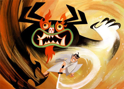 This is a promotional image for the popular animated television series Samurai Jack, which ran from 2001 to 2004 on Cartoon Network. Created by famed TV animator Genndy Tartakovsky, the show is a throwback to old Japanese cinema that centers on a Samurai warrior who confronts and nearly defeats his nemesis the Satanic Aku. But before he can deal the final blow, Aku opens a portal in time and sends the Samurai into a bleak, dystopian future ruled by Aku. After an encounter with some jive-talking locals, the Samurai takes on the name "Jack" as an alias and travels the world while trying to find a way back to his own time to stop Aku. Naturally, Aku tries to stop Jack from accomplishing this task.
I was surprised by how much I enjoyed this show. It has a number of unique traits that gives it an identity of its own. For starters, it has a distinct animation style that uses no outlines, giving it a resemblance to shadow puppetry. It fits the tone well, paving the way for colorful characters and settings. Although the animation is simple and very stylized, there are also great lighting and shading effects and crisp textures.
As great as the visuals are, they would be nothing if the show's content wasn't worthwhile as well. No problems there. Samurai Jack is an amazingly well-crafted piece of work. Each episode drips with atmosphere and imagination. Although there are many homages to classic Japanese cinema, the show always has something fresh and interesting to stand out on its own. Its most notable characteristics are high-adrenaline action sequences that can take place anywhere from underwater to inside an active volcano, and especially long sequences without dialogue. Many TV cartoons fall into a bad habit of requiring that a character say something every minute, in a heavy-handed attempt to avoid alienating the viewer. Samurai Jack subverts this tired cliche by letting the pictures do most of the talking. Most episodes have only about a few dozen lines of dialogue at most. The action scenes, in particular, are usually almost completely devoid of dialogue. This adds real tension to these sequences when it's easy to see that the characters really are fighting for their lives. Instead of stopping mid-fight to trash-talk each other, characters will communicate with each other subconsciously through subtle facial expressions and changes in their battle technique. Best of all, since these characters and the world they live in are animated, real-world laws of physics fly out the window as the characters perform stunts and feats that would be next to impossible with live actors.
All in all, Samurai Jack is a great show. It presents distinct, beautiful animation, boundless imagination, and clever use of imagery and sound.
Wednesday, September 9, 2009

 The above image is a promotional poster for Star Wars: Clone Wars, an animated television series that aired on Cartoon Network from 2003 to 2005.
Overall, I like the look of this show a lot. Animation should do things that are impossible in live action, and that's exactly what the show does. One issue I've always had with the live-action Star Wars films is that the characters tend to "pop" out of the animated environments. Here, the characters' hand-drawn counterparts feel right at home. They are heavily stylized, with jagged edges, exaggerated features, and thick outlines. This allows them to fit in with the backgrounds better, and thus, ironically enough, come across as more believable than they do in the live-action films.
Not only does the animation allow these characters to seamlessly blend into their environments, but it also paves the way for some truly amazing action sequences and set-pieces. The action has a level of creativity, lightning-fast pacing, and efficient editing that would be next to impossible with live actors.
Unfortunately, not all marks are hit. My main issue with the animation style is that, while it's nice to see simple character designs, they occasionally come across as being oversimplified. There's not a lot of detail to be found, and the lighting and shading leaves something to be desired.
Even with such misgivings, I can still safely say that Clone Wars is a great-looking show. It presents slick, stylized characters, colorful environments, and breathtaking action sequences and set-pieces that the live-action Star Wars films can't hold a candle to, and on those merits, it succeeds with flying colors.
References
"The Random Curiosity Thread" 9 Sept. 2009.
Tuesday, September 8, 2009
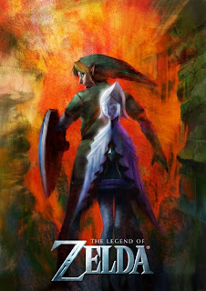 This is the first (and to date, only) piece of promotional artwork related to the upcoming installment in The Legend of Zelda video game series. For the most part, I do like the picture. There's a nice color scheme with the reddish-orange background providing a contrast with the comparably darker shaded characters in the center. The blurry surroundings offer an air of mystery without giving the impression that the artists are cheating or cutting corners. While some may be taken back by how obscure the background is, I say less is more. The more mystery there is in the image, the more intriguing it is. That being said, I do have some misgivings.
One problem the picture suffers from is inconsistency. The bright orange center is too abrupt of a change from the brownish surrounding. A more understated transition would have been nice. Another problem is that the image might be a little too unclear. It's understandable that the game's designers would want to keep things under wraps until the final product itself was released, but fleshing out the details just a hair more wouldn't have hurt my feelings.
Despite such problems, the picture gets more right than wrong. It presents an interesting light/dark dynamic and a degree of mystery that doesn't feel like it's cheating, and those things are what really sell it.
References
"The Legend of Zelda Wii" 8 Sept. 2009. http://www.zeldauniverse.net/wp-content/uploads/2009/06/zeldawiiposter1-423x600.jpg
Sunday, September 6, 2009

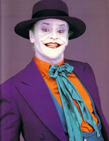
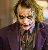
Batman's arch-nemesis, the deluded anarchist known only as the Joker, is every bit a pop culture icon as the Dark Knight himself. He's psychotic, charming, clever, hilarious, and more. Being such an unforgettable figure, he has been adapted in numerous other media outside his comic book origins, the above three being among the most famous. Each rendition of this chaotic clown brings its own flavor and unique quirks to the character, but remains true to the classic elements loved and/or hated by many. These unique elements are reflected in the character's physical appearance in each portrayal. Whether he's a cackling idiot, a homicidal mastermind, or somewhere in between, you can tell a lot about a Joker just by looking at him.
The Joker's first major adaptation outside the comics was in the long-running 1960s Batman television series, in which he is portrayed by Caesar Romero. A lot of this show shed the darker, more mature aspects of Batman mythology in favor of camp sensibilities, and the Joker was no exception. He was now a harmless prankster who built gadgets like giant typewriters and challenged Batman to surfing competitions. This Joker was silly in almost every way imaginable, and his design was no exception. His make-up is a little less creepy and a little more cartoony than the other renditions. It works within the show's universe, but some of the aesthetics bother me. The pink color of the suit and the absence of green hair detract from the overall look a little, but like everything else in the show, the character is fun and entertaining, and that's what matters in the end.
Another famous non-comics version of the Joker is Jack Nicholson's take on the character in Tim Burton's Batman. This rendition was still a little campy, but most of the camp was mixed up with Burton's trademark black comedy. The costume is definitely one of my favorites. There's just enough camp that's appropriate for the character, but the design also establishes charisma and poise. It's interesting to see the two major facets of the Joker's personality reflected in his appearance.
Perhaps the most popular take on the character, however, is the late Heath Ledger's portrayal in Christopher Nolan's The Dark Knight. This Joker continues the trend of progressively darker renditions by making the character even more sinister and less pranksterish than the Nicholson version, and the design of the costume and make-up capture this really well. The sloppy appearance of the make-up fits perfectly, and the seemingly haphazardly stitched outfit also complements the character's sadistic personality. In this version, all the small details come together and click flawlessly.
Subscribe to:
Comments (Atom)