Wednesday, October 28, 2009

Now here's something Batman fans can really sink their teeth into (thank you, thank you, I'll be here all week): a birthday cake based on the Dark Knight himself. Nowadays, you can make a birthday cake based on just about anything (and I mean anything), but what got my attention here was that fact that this cake was themed around, well, Batman. Batman is a cultural icon known for his dark, grim, personality, so what is his insignia doing on a bright, cheerful birthday cake? Well, I don't exactly have an answer to that question, but I do believe that it ties in closely with a very important idea in design: creativity.

In one discussion we had in class, Prof. Mannheimer said that the true mark of creativity is one's ability to combine two vastly different things to create something new. Although I can follow that sentiment, I think there's a bit more to it than that; not only does creativity involve combining two different things, it also has to avoid losing the best elements of those two things. For instance, while pop culture-themed birthday cakes are hardly anything new, here, the idea works far better than it has any right to because there aren't any sacrifices being made. The bright, vibrant yellow helps bring out the cheerful "birthday cake" aspect of the design, and the black helps bring out the dark, "Batman" side. Overall, a solid job at combining the best of both worlds to come up with something fresh and new.

References
https://blogger.googleusercontent.com/img/b/R29vZ2xl/AVvXsEjUkkntnWz8AHp0vPa9sVdylJaiN7RUj7_5KBw3KFVxsMSckT1cruvOUl4Ha-ahPbk6UuSUdJRE8tsYePGZ1nZPLr0gjLhA8UBO9eKMVqzV5Uql2FYZ1I9Z10QU8y1dcFoEzp5evlamLAQO/s1600-h/lauren+batman+birthday+cake+1.gif

Sunday, October 25, 2009

This is a promotional image for Batman: The Brave and the Bold, a currently-airing series on Cartoon Network that debuted last year. The bright, colorful visuals in this image may have some die-hard fans of the dark, gritty Caped Crusader trembling with fear, but any fan of this series knows that this is a very different take on Batman, one that has a lot more fun with the character than most modern renditions of the Dark Knight. Overall, this show is very much a throwback to the Silver Age of Comic Books, which spawned the likes of Superfriends and the 60s TV show. What immediately sets The Brave and the Bold apart from those productions (aside from a basic level of respect for the Batman comics) is its post-modernism and self-awareness. In other words, imagine Superfriends if the comedy was actually intentional, and you pretty much have Batman: The Brave and the Bold.

All-in-all, there's a lot I've enjoyed about this series, but the true standout has been the animation. It's simply terrific. The animation does a great job of emulating the show's fun, light-hearted atmosphere with its vibrant colors, simple character designs, and cartoonish aesthetic. Being a TV series, it's not as polished as what most feature films have to offer, but it is several cuts above what most animated TV shows of recent years have on store. The characters, despite being rather simply-designed, are expressive and colorful, with their designs emulating their unique personalities. The various locales also show creativity, ensuring that things stay fresh and interesting. Gotham City is especially impressive, mixing up aspects of darker elements such as the Tim Burton Batman films and Batman: The Animated Series with more light-hearted touches, allowing it to fit in with the show's lighter tone while remaining the Gotham that Batman fans everywhere know and love. Overall, Batman: The Brave and the Bold is a well-conceived and highly entertaining series, boasting colorful characters, diverse locales, and polished animation that manages to fit in all aspects of Batman mythology. I'm looking forward to seeing more.
This is a screenshot from the teaser trailer of Pixar's highly-anticipated Toy Story 3, slated for release this summer. I was surprised by how much the animation has improved on the previous two Toy Story films. While I was anticipating improvement, my expectations weren't anywhere close to what was ultimately delivered. The visuals on hand are incredibly slick and polished, and leaps and bounds above the already-excellent animation of previous Pixar productions. There's a lot of great shading and lighting, the characters are expressive, and there's a certain amount of cartoony warmth and atmosphere that gives charm to the proceedings without being overused. Despite the vast step up, however, the animators were wisely restrained, allowing them to remain faithful to the previous two films. It may look a whole lot better, but this is still very much the universe we were introduced to in Toy Story and Toy Story 2. Overall, great stuff; I was a little skeptical before about how the film would turn out, but if this teaser is anything to go by, it looks like the finished product will deliver.

Friday, October 23, 2009

http://www.youtube.com/watch?v=v1kNEGyNQ54

This is a video of famed Canadian magician Jay Sankey performing an amazing card trick of his own invention. Personally, I think his performance is near-perfect; the execution and timing of everything is flawless. My favorite thing about it is the use of a compelling narrative to frame the trick. As I mentioned in an earlier dissertation about Ricky Jay, a narrative is a great way to make a feat of magic really speak to the audience, and that's exactly what Sankey does here. Plus, he also makes sure his narrative involves elements that the audience can relate to. Everyone has dreams, takes photographs, and plays with playing cards, so despite the supernatural air inherent in any feat of magic, Sankey's narrative makes some sense to people by adding up ordinary phenomena to come up with something extraordinary.

Sankey's wonderful performance ties into design because his narrative method of presentation is really an issue designers have to think about all the time. A design can't simply be an amalgam of outlandish elements; it won't make any sense, and it will alienate people. Any design has to be something that people can relate to in some way. That being said, it's easy too go too far on the other side of the spectrum and deliver something that people are too familiar with, which makes for a bland, unoriginal design. The key is to assemble familiar elements to make something new. Apply conventional things in unconventional ways. Turn the ordinary into the extraordinary. Only then can a design accomplish the best of both worlds by delivering something that people can both relate to and be impressed by at the same time.

Thursday, October 22, 2009

Pinpointing exactly what makes a classic is hard to do. A great design manages to engage audiences, but a classic goes one step further. It somehow manages to transcend time and remain in the public's eye for years to come. But how does one make something that's truly timeless? Do you need the foresight to predict how audiences will react to your work in the future, or do you just get lucky? A quick look at just about any "Best movies of all time" list will yield the likes of Citizen Kane, Gone with the Wind, The Wizard of Oz, Star Wars, and Raiders of the Lost Ark. So how have these films become embedded in pop culture while several of their equally esteemed contemporaries got lost in the shuffle? Well, there are bound to be endless theories, so I'll take the plunge and provide my own.

In a scene from Tim Burton's Ed Wood, the titular B-movie director is confronted by a member of his production crew regarding a continuity issue that came up during their filming of Plan 9 from Outer Space, to which Wood responds, "Filmmaking is not about the tiny details. It's about the big picture!" Wood is being a little extreme when he opts to completely neglect the "tiny details" for the "big picture", but his sentiment nonetheless holds some insight. When looking at any great motion picture, the whole is always greater than the sum of the parts. While audiences may remember individual scenes, bits of dialogue, and standout performances from the "classic" films they hold near and dear to their hearts, what they truly value about the movies they love is each of those movies as a whole, or in other words, the "big picture". However, there's a very good reason why Ed Wood is reviled as the worst director of all time, and, if Burton's quasi-biopic is anything to go by, it's because he ignored the tiny details. Plan 9 from Outer Space is rife with a ridiculous story, laughable dialogue, and poor acting. Just because the big picture works, it doesn't mean the details should be overlooked because the details add up and impact the big picture, for better or worse (generally for worse when speaking of Ed Wood). Thus, what makes a design a true classic is the designer's ability to avoid working solely at the micro or macro level; they key is to find a balance between the two.
Video games have changed a lot over the years. Obvious as that may sound, many people fail to realize the vast difference between the way games are now and the way they were when they first became mainstream entertainment. Where they were once huge machines that usually lasted an hour or two while eating quarters like a turkey on Thanksgiving, they now come in the form of small, portable consoles that host epic, sprawling adventures that can last up to a full workweek, if not even longer. One of the many advancements in modern games has been in storytelling. It all started with the arcade classic Donkey Kong, which offered up a plot revolving around a tubby carpenter saving a damsel-in-distress from a King Kong knockoff. Now, we have games rich in dynamic characters, moral complexity, and cinematic immersion. But has this change truly benefited modern video games? Is it really necessary for a game to have a compelling story, or is it only the gameplay that truly matters? In a controversial move, Shigeru Miyamoto, founder of Nintendo and creator of Donkey Kong, is going out of his way to make the upcoming and highly-anticipated Super Mario Galaxy 2 have as little plot as possible. "I'd like to go with as little story as possible," he told Wired magazine in an interview. "I've always felt that the Mario games themselves aren't particularly suited to having a very heavy story." Complicating matters is the fact that Galaxy 2 director Yoshiaki Koizumi disagrees with Miyamoto's sentiment and has expressed interest in bringing more story elements into the Mario games.

This issue has divided video game players into two separate camps: some agree that games need better storytelling to give them a more immersive experience, but others are like Miyamoto and hold the mindset that less is more, believing that a complex story can interfere with the gameplay, making games less interactive. Then there are people like me, who are on the fence. Although I don't see an interesting story as an absolute necessity towards making a great game, it can be a great asset. I have played many excellent games, Mario games included, that have little to no story, and on the other side of the equation, I have played some mediocre games that couldn't be saved by great storytelling. In the end, though, I have to agree that compelling stories are indeed a part of video game evolution too significant to ignore. Not every game needs a great story, but those that do have at least one advantage over those that don't.

References
http://www.wired.com/gamelife/2009/06/super-mario-galaxy-2/
As something of a follow-up to my dissertations on The Legend of Zelda, I'd now like to discuss one of the big challenges of design: the balance between simplicity and complexity. A good design generally has to be simple enough to be easy to understand, yet also complex enough to maintain audience interest. The challenge is that the distinction between simplicity and complexity is never very cut and dry. What may be too complex to one person may be overly simplistic to someone else. In my Zelda discussions, I mentioned that The Wind Waker and Twilight Princess led to a split in the Zelda fanbase; those who preferred the former appreciated the simplicity of its art style and criticized the latter for "trying too hard" to be more detailed and complex, while those who preferred the latter criticized the former for having an oversimplified art style by "dumbing things down". How does a designer deal with this sort of thing? How can you compromise and come up with something more satisfying? Going back to the Zelda discussions yet again, I said I ultimately preferred The Wind Waker because despite its simplicity, it still has plenty of crisp textures and slick animation that is somewhat lacking in Twilight Princess. Thus, one possible answer to this dilemma is, when trying to achieve that balance between simplicity and complexity, it may be best to center primarily on one of the two while finding ways to integrate elements of the other. The Wind Waker, for example, succeeds because it boasts a simple, no-nonsense design at first glance, but when one digs deeper for finer subtleties, there is a surprising degree of attention to detail to be found.

Wednesday, October 21, 2009

Ever since the seventh, current console generation began in 2005 with the release of the Xbox 360 and continued into 2006 with the simultaneous launch of the PlayStation 3 and Wii, each console has been more-or-less defined by its target demographic, with the Xbox and PS3 skewing for older audiences and "hardcore" players and the Wii being partial towards "casual" players. That being said, there's a lot of overlap. The Xbox and PS3 have their fair share of "casual" games, and the Wii in turn has plenty of games made for the "core gamer". All of this begs an interesting question: Is it the designer's obligation to design their work for a particular demographic? Or can they design something for a "general audience"? To both questions, I say yes and no. A designer shouldn't try to please everyone because they simply can't. There's always going to be people who don't like something. On the other hand, it's also not a very good idea to go after one specific demographic and shut everyone else out. When all is said and done, it's a balancing act. The true challenge of any designer is to combine breadth with depth. The challenge is to not only get a general audience interested in your work, but also to get as many people as you can invested in it for as long as possible.
http://www.rifftrax.com/

This is the home page for the official website of Rifftrax, a spiritual sequel to the popular TV series Mystery Science Theater 3000, following that show's premise of people who watch movies and make snide remarks about them. You can by audio MP3 files and play them in sync with DVD copies of the movies being "riffed". Said movies are not limited to 50s sci-fi B-movies, as was the case with Mystery Science Theater, but extend to recent big-budget blockbusters like Transformers and Pirates of the Caribbean. Following is a compilation of jokes from the crew's "riff" of The Empire Strikes Back.

http://www.youtube.com/watch?v=37X1QJa79gI

It's interesting how an achievement as esteemed as The Empire Strikes Back, with some of the most dramatic moments in cinematic history, can be made hilarious by cracking some jokes over some of the various things said and done in the film. This ties in closely with some of the recent in-class discussions we have had about context and about how much design depends on it. As evidenced by this video, a work with one particular meaning can mean something completely different when looked at in a different context. When Luke gets some heavy news from Darth Vader, a dramatic, and even somewhat horrifying, scene becomes funny thanks to a quip from one of the Rifftrax commentators: "That would explain my love of capes!" The Rifftrax slogan ("We don't make movies. We make them funny!") ties in perfectly with the idea of context. The commentators manage to take a dramatic piece of cinema and turn it into something funny simply by changing the context of what unfolds on screen.
http://www.cracked.com/photoshop_90_the-world-tomorrow-if-internet-disappeared-today/

This is a page with various Photoshopped images providing tounge-in-cheek theories on what would happen to the world if "The Internet disappeared today". Overall, I found this to be a hilarious look at how much we depend on the Internet nowadays. My personal favorite images are the "Twitter pigeons" (#18), the "ebay store" (#15), and the "white message board" (#13). It's really interesting how the Internet has not only changed the way we see the digital world, but the way we see the world as a whole. On a computer screen, stuff like the things depicted in the images would be perfectly normal, but they become much more ridiculous once they are kidnapped from the Internet and put in the real world. This fits in with what we've been discussing in class recently about context; the various elements in each image aren't very funny on their own, but when put together, they become funny within the context of the image.

Wednesday, October 7, 2009

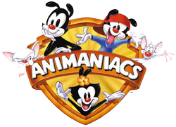
This is a promotional image for the Warner Bros. cartoon Animaniacs, a Looney Tunes-esque comedy series featuring original characters and shorts that ran from 1993 to 1998. The show's humor was a broad mix of old-fashioned cartoon wackiness and pop culture references, among other things, with one of its most distinct characteristics being its post-modern, self-aware look at classic cartoon themes. This self-awareness is reflected in the show's three main characters: Yakko, Wakko, and Dot, (collectively referred to as "The Warner Brothers (and the Warner Sister)"), pictured in the image. During the show's creation, the Warners were originally supposed to be ducks, but supervisor Tom Ruegger shot down the idea because "...everybody had ducks" and ultimately decided on a "...generic animal creature", designing the trio in the style of old black-and-white cartoon characters of the 1920s and 30s, with simple black drawings and white faces (e.g., Felix the Cat, Oswald the Lucky Rabbit).

In addition to the trio's post-modern take on cartoon humor, one running gag throughout Animaniacs is the question of what species the Warners are supposed to be modeled after. Unlike the rest of the show's cast, which comprises of humans, mice, squirrels, pigeons, and more, no one really knows what the Warners are, not even themselves. In-universe characters and fans of the show alike have called them everything from mice to monkeys to "puppy children". The Warners themselves used this discrepancy as a source of humor from time to time; one sketch devotes an entire musical number to guessing their species, only for the trio to conclude that they are "cute".

Overall, I found this ambiguity to be surprisingly enjoyable, and one of the most memorable things about these characters. Although the Warners don't seem to be any particular animal or species, at the same time, they don't come across as alien either. More often than not, when you're designing a cartoon character, you're setting yourself up for seemingly endless ways to succeed, but even more ways to fail. The trio's ambiguous species representation thus allows the animators to kill two birds with one stone; on the one hand, they put a clever twist on the age-old theme of anthropomorphic cartoon animals by having these characters not really be animals at all, and on the other hand, they aren't really alien or overly abstract either, allowing them to come across as believable. The animators effortlessly blend stylization with believability and creativity with convention to create characters that are both entertaining and emotionally investable.

Sunday, October 4, 2009

This year, I was lucky enough to not only be inducted into the Alpha Lambda Delta/Phi Eta Sigma chapters of the National Honor Society here at IUPUI, but I also became one of the organization's webmasters. It looked like the five of us webmasters had quite a bit of work to do because ALD/PES at IUPUI was known for many things; their website wasn't one of them. At our first webmaster meeting, our first decision was to completely tear down our current website and start from scratch. Why, you ask? This is why.

This website is practically a textbook example of how not to make a website. It makes almost every basic web design mistake in the book.

The color scheme is bland and makes things hard to read, the tabs are distributed completely at random with no rhyme or reason, and there are large amounts of text in small areas.

Overall, this website is a crushing disappointment. If we're going to revamp, we'll have to start all the way at the beginning.

Saturday, October 3, 2009

http://headfirstlabs.com/books/hfhtml/chapter12/lounge/lounge.html

This is a web page set up to demonstrate basic web development with HTML and CSS and demonstrate good web design. True to its purpose, the page is slick, polished, and aesthetically pleasing, and a true testament to what can be done with only basic web development tools. There are a lot of subtle touches, with its smart implementation of font colors and sizes, the effective use of space, the clean look, and the overall symmetry, that click together and add up to make a great-looking web page that avoids many of the missteps of web design.

Many websites fall into several bad habits, one of which involves the use of overly flamboyant colors, whether it's for graphics, text, or backgrounds. This page eschews that mistake by opting for a more understated color scheme, in the form of a magenta logo and aqua-colored headings. This allows for a nice "Goldilocks effect". There aren't too many colors to make the page seem overbearing, but there aren't too few colors either so as to make it come across as bland or uninteresting. Instead, there's a good balance between having just enough color both to maintain a simple and polished look and to maintain users' interest.

Another common misstep in web design is putting too much content on a single page, making the page cluttered and disorganized. This page avoids that problem as well with its streamlined look and feel. There's not a lot of content on the page, but there is just enough to keep things interesting, proving once again that simple is sometimes better.

One of the big reasons why the page is so well-made is because of its simplicity. But as wonderful as simplicity can be, when overused, it can lead to another infamous design misstep: oversimplification. Sometimes, a website can be too simple to the point where users feel like it's boring or dumbing things down. No problems here, though. Although simple and streamlined, this web page manages to remain vibrant and interesting, thanks to a smart color scheme and thoughtful implementation of font sizes and styles, spacing, and margins. One particularly nice touch is the addition of the "Weekly Elixir Specials" section in its own border on the right-hand side of the page. This allows the elixirs to remain visible on the page but without it intruding on the rest of the content. Furthermore, I also like the "guarantee" text indented in its own aqua-colored border in the middle of the page. While some might be a little put off by its arguably intrusive position in the middle of the "Welcome" section, I think it works because its subdued color and text keep it from being to overwhelming or abrupt.

Overall, this web page is practically a textbook example of good web design in action, presenting understated colors, clean organization, effective use of stylistic elements, and a skillful balance between simplicity and complexity.

Thursday, October 1, 2009

http://www.youtube.com/watch?v=IX9adPALLzA

This is a video of famed card magician Ricky Jay performing an amazing feat of mentalism. Supplementing the magic to be found is one of Jay's trademarks: stage patter. Jay complements the effect with a compelling story from classic Japanese cinema. Having studied and performed card magic for quite some time myself, this performance turned out to be not only an entertaining magic trick, but also a valuable learning experience.

When I first got into magic about five years ago (I was a freshman in high school at the time), I fell into the same "trap" that many novice magicians were susceptible to: I thought the magic tricks themselves were the only thing that mattered in a performance. When learning a new trick, I would focus exclusively on figuring out the secret of the trick. In performance, I would just go through the motions without really putting any life or energy into the magic and was content with merely getting "Wow!" reactions from my audience. In my defense, my audiences probably weren't lying; my shows were certainly enjoyable. But I wasn't really putting any life into the magic. It took me quite some time to understand that knowing how a feat of magic was done was only half the battle. The mark of a true magician is their ability to present their magic in unique, engaging ways. An excellent quote from the legendary Mark Wilson sums it up best: "A trick is only as good as you make it look!"

Today, I continue to astound people with my feats of magic, and I enjoy it just as much as I ever did. Only now, though, I understand what it truly means to perform magic. A magic trick is, at its core, a story. It all fits; there's an introduction, a rising sense of suspense, a climax, and an ending, just like any story. Every great magician, like Ricky Jay, knows this all too well. You can get all the "Wow!" reactions you want just by going through the motions the easy way, but the catch is that people forget that. They forget the things you do. What they never forget, however, is how you make them feel. Thus, that is the challenge of any magician, a challenge that extends to all artists and designers as a whole. People who see your work won't remember what you did years later. What they will remember is how it made them feel. If you can't touch people emotionally somehow, you'll be like vapor. You'll never leave any sort of impression on people. Instead, you'll just become old news.